Assessing Usability and Visual Appeal During a Large-Scale Site Redesign
Challenge
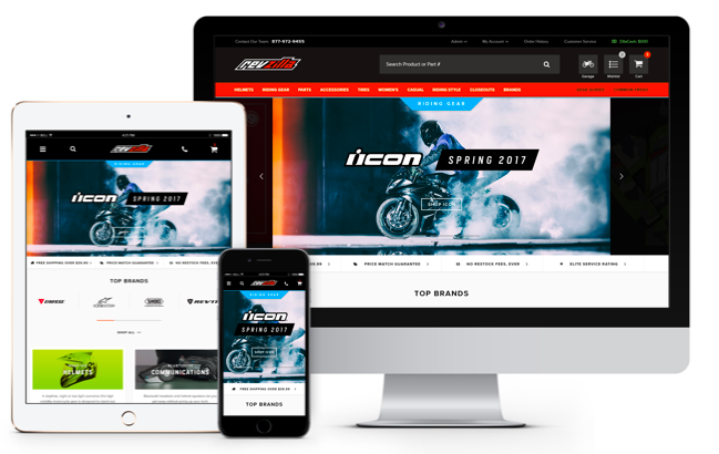
From its launch in 2007, RevZilla re-shaped the online motorcycle gear and parts shopping industry with its tech-forward, customer-obsessed approach. But by 2016, the site infrastructure–custom-built by its team of developers–needed a major overhaul to become responsive and mobile-friendly. I joined RevZilla at the cusp of the site re-launch, when the team needed help better understanding implications to major shopping path changes as well as sentiment on the revamped site visual design.

Approach
After working with merchandisers, customer service, and other internal experts, I identified several core scenarios and shopping flows to test. I also met with stakeholders to better understand questions and concerns regarding the relaunch, particularly surrounding the ideal of visual appeal and “overdoing” the visual design. Ultimately, I identified two goals for the evaluative research project: 1) assessing usability (task efficiency, task completion, reported task ease, among other metrics), and 2) assessing visual appeal reported by returning customers (triangulating data from qualitative first impression assessments, willingness to shop, likelihood to return, and other sentiment scores)
Research Methods
- Task-based unmoderated and moderated usability studies
- Exploratory shopalongs
- First click tests
- Qualitative A/B tests
- Feedback analysis
Impact
- Guided key improvements to design
- Encouraged need to shift to mobile-focus
- Guided changes to visual design
- Highlighted important features for next iteration
The new design is sophisticated, more interesting, more inviting, more pleasurable to shop…In the past few months RevZilla continues to get cleaner and cleaner. It’s a cut above other motorcycles sites. It’s so well-thought out. -Customer Interview
